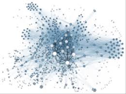
All the rage right now in big data and analytics is advanced visualizations. These are fast-becoming coveted features in the growing market for maps and charts and other new and innovative ways of visualizing and processing all that data. Within the last year, almost every business intelligence and analytics vendor has added an advanced visualization model or add-on to capture this new market for visualizations. This includes the big players, for example IBM Cognos Insight, Microstrategy Visual Insight, SAP Visual Intelligence and Microsoft Power View.
 This is down to the fact that visual discovery is now in big demand, writes Doug Henschen in Information Week. Indeed, market share stats show that Tableau Software – one of the leaders in advanced data visualization – was the fastest growing vendor in business intelligence in 2011, almost doubling their software revenue.
Why is visualization such a big deal right now? In short, it makes data-analysis much, much easier. One of the most commonly cited challenges with regards to the use of conventional business intelligence query and the usual analysis tools is to do with the ease of use. This increases exponentially as the software becomes more complex or the employees less tech-savvy.
For example, Match.com – arguably one of the biggest online dating service providers – started using Tableau Software to put the data analysis “In the hands of our users, not elite analytics of BI experts,” in the words of Atin Kulkarni, senior director of strategy and analytics. Important here, cites Kulkarni, is the ability to perform geospatial visualizations that put it head and shoulders above the standard charts and graphs of the basic office suite. Match.com are expanding into the real world with offline dating events; cooking classes, wine tasting and the like to expand its online dating business.
However, to draw customers it needs to draw its users to a particular location. Using data visualizations superimposed onto a map, the ability to see instantly where clusters of users of compatible age and gender occur. This allows the Match.com team to easily identify promising neighborhoods for their events so they can start ringing around venues.
The question is how to separate the ‘advanced’ visualization products from the chaff? Six traits separate the advanced visualizations from static graphs: dynamic data, visual querying, linked multi-dimensional visualization, animation, personalization and actionable events. This is exactly why big data and analytics are crucial issues inextricably linked to the data-visualization conversation. Big data insights and big data predictions, while useful on their own, are understood much more easily – and crucially – much more quickly when presented in a visual and accessible form.
Big Data and related technologies – from data warehousing to analytics and business intelligence (BI) – are transforming the business world. Big Data is not simply big: Gartner defines it as “high-volume, high-velocity and high-variety information assets.” Managing these assets to generate the fourth “V” – value – is a challenge. Many excellent solutions are on the market, but they must be matched to specific needs. At GRT Corporation our focus is on providing value to the business customer.
Understanding Technical Pumps Failures: Types, Impacts, and How to Avoid Them
Industrial pumps are essential in many sectors, including water and wastewater management, oil and gas, power...


